PROBLEM
Technicians are overwhelmed by the number of tabs and fields of information presented in a job ticket. As a result, they are unable to find what they need, which leads to inefficiencies in performance when servicing the customer and a lack of trust in the tool's capabilities.
SOLUTION
The new App T repositions key information upfront on job tickets and groups secondary information in relevant groupings tucked into lightboxes so that the technicians can focus.
Tech Mobile+ (ongoing)
 |
|---|
DESIGN ROLES
DESIGN ROLES
User Research
Conducted focus groups, 1:1 interviews, and field rides, with over 100 technicians across Canada
Wireframing + Prototyping
Worked on over 7 iterations, giving art direction on wireframes through to detailed Figma prototypes
User Testing
Created and conducted moderated and unmoderated tests to validate new ticket layouts with technicians
OTHER ROLES
Project Management
Vetted requirements with I.T. and related project stakeholders to ensure all fields were accounted for
Mentorship
Led a team of 3 junior designers through the project, working collaboratively on the design
User Acceptance Testing
Managed the process, building test cases and guiding testers to vet developed features
Due to the apps being internal and confidential, fictional names will be used to represent them in the text.
 |  |
|---|---|
 |  |
"Information is missing", "information is sometimes incorrect", "way too much info" among quotes

Over 60% of the current ticket layout was deemed redundant or irrelevant on average
CONTEXT & RESEARCH
Technicians use a web app called App H to view job information. The ticket UI splits the job information over 7 tabs, where the technician can either tap each tab in a horizontally scrollable menu to access the required information or swipe left/right to flip between adjacent tabs.
While conducting focus groups, the technicians quickly pointed out large sections of each tab with redundant or irrelevant information and often insisted in requesting for a summary page highlighting key information.
Upon further investigation through 1:1 interviews and field rides with technicians, the root of the problem lied in unfamiliarity with the location of information because of the information overload from having 7-8 tabs. People did not understand the information architecture around the groupings of information placed in each tab and would often flip back and forth through the tabs until they found what they were looking for.
To summarize, people got lost in all the tabs of information and wanted an easy way to find the information they needed when they needed it.
USER FOCUS: THE TECHNICIAN
Technicians' core job is to perform a service for a customer: an installation or a repair.
-
Design for software catered to mobile platforms (80% use) vs. desktop (20% use) due to convenience of carrying phone on-the-go (depends on the job however)
-
Tech-savviness varies, but the business has emphasized a need to ensure less tech-savvy members aren't hindered
-
Majority of work is done outdoors; factors like screen interactions during cold weather or screen visibility under sunlight need to be considered
-
Technicians are assessed on a number of factors, including time taken to complete a job. Thus, it is important that any contextual information provided to them is concise so that their performance is not hindered.
 |
|---|
USER JOURNEY: WHAT DOES A TECH NEED TO KNOW FOR A JOB?
As the problem was rooted in not understanding the information architecture of the current layout, a study on the user journey would help to identify what to focus on. A technician's journey on a job consists of 3 parts: Pre-job, Arrived on site, Post-job.
As the source of confusion revolved primarily around the Pre-Job and Arrived on site parts, redesign efforts were placed only on those 2 phases. The 5Ws were used to dissect those 2 phases of the technician user journey and come up with the core question areas technicians asked themselves in order to begin work on the job:
-
What is the goal? (Why)
-
Appointment (When, where, who)
-
What do I need to bring? (What)
-
What do I need to do? (What, why)
The data labels and fields were then plotted under each question area to identify which fields were most important to techs.
 |
|---|
Through this exercise, it became evident that App H was one of the technician's first touchpoints in the technician app ecosystem intended to aid the technician in physically completing his or her job. A further investigation into the app ecosystem led to a macro-level user journey outlining where App H stood in the technician's app journey.
Schedule
Technician logs in and sees their jobs for the day
App H | Job details
Technician examines a specific job and looks at details to understand the job
App H | Complete or Incomplete
Technician completes or incompletes the job once work is done to the best of a tech's capabilities
App H | Reports
Technician reports work done and clocks hours and charges
Other apps
Technician opens other web apps via new tabs to get additional context (i.e. running speed tests)

The macro-level user journey helped to provide an understanding that the solution needed to seamlessly connect to the other apps in the ecosystem to ensure the technician experience was not disrupted.
SOLUTION: A CONCISE JOB TICKET UPFRONT
Wireframing for the solution was done in 7 core rounds with each successive round expanding on the last. With the context around the high volume of data fields and the limited amount of time technicians spent on understanding the tickets, it was clear that the solution needed to be concise and show what was important upfront. Members from the operations teams were engaged throughout the wireframing process to vet the concepts.
Screenshots of the 7 tabs
in the current layout
 |
|---|
 |
 |
 |
 |
|---|
 |
|---|
 |
|---|
WIREFRAMING ROUND 1 (LO-FI): Widget Concept
The goal of this first round of wireframing was to begin rethinking how to lay out the information in a cleaner and more concise manner. As part of the problem with the current layout was how spread out the information was (over 7-8 pages), an attempt was made to detach the thought process from using pages as a layout. This led to the concept of using widgets to show the information, as widgets were essentially visualized, compact groups of related information and also allowed for flexibility on the design of the overall ticket layout, which would be explored in the next round of wireframing.
A card sorting exercise was done on the current layout by cutting out every field on a print-out of a current ticket and re-sorting each field out of context from the layout. The groupings of fields then were aligned to the 4 core question areas from the user journey.
Preliminary sketches were done on each group to attempt creating widgets for each group with the intention of these widgets being laid out together to create the ticket layout.
 |
|---|
 |
 |
 |
|---|
 |
 |
WIREFRAMING ROUND 2 (LO-FI): Overall Job Ticket UI
In the second round of wireframing, the team fleshed out the widgets a bit more and began exploring the overall ticket interface design and experience.
Fleshing out the widget designs
The widgets were iterated on to see how the data in each widget could be visually shown. Features and functionality were also discussed for each widget, looking into what technicians needed to do in each widget, such as calling the customer or getting directions.
 |
|---|
 |
 |
Putting it all together into an interface for the first time
The widgets were then organized into the 2 parts of the user journey: Pre-Job and On Site. While there was an overlap in the information reviewed pre-job vs. while on site, it became apparent that technicians only cared about the On Site information when they were on site. As a result, it made sense to separate the On Site information, resulting in 2 distinct sections.
The interaction to travel between the 2 sections was also looked at, comparing a simple scrolling system to something akin to how Google Photos transitions between previewing a photo to getting details on the photo; an anchored scrolling experience.
 |
|---|
 |
WIREFRAMING ROUND 3 (LO-FI / MID-FI): Detailing Out the 2-Part Job Ticket
With the third round of wireframing, the concept of a 2-part ticket started to take root. The widgets were each detailed out further while being positioned in one of the two sections of the job ticket. Having the ticket consist of 2 sections was imperative to the redesign's selling point, as it was already a much more concise view of the job compared to the 7-8 tabs from the current layout.
Pre-Job interface
4 widgets were determined since Round 2 to be placed in the Pre-Job section: Details, Appointment, Customer, Products (+ Equipment). In this round, they were rearranged in multiple iterations to determine their best placement. The widgets themselves also were iterated on to see if the information could be further simplified.
The goal was to ensure a snapshot of the ticket could be seen at a glance with no scrolling. The Appointment widget, for example, was colourized and given an icon for accessibility reasons so that technicians could recognize when the appointment would be simply through colour / image recognition.
 |
|---|
 |
|---|
V4 (Pre-Job)
Details
Outlines what type of job it is
Appointment
Details when the job is; intervals are pre-set standards
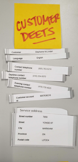
Customer
Details who the customer is, where the job will be located, and how to contact the customer
Products + Equipment
Details what products the customer ordered / has, and the equipment the technician needs to bring on site to set up the products
Note that the browser navigation and top navigation header would still be placed above this screen
On Site interface
The On Site section consisted of what was called the Work Specifications from the current version, which outlined a breakdown of cable ports the technician needed to connect wires through from the company's central offices to the customer's premise.
The biggest challenge with wireframing the On Site section in more detail was understanding the technical aspects of the information, so operational members were consulted more regularly with these wireframes. The wireframes still had the same objective of trying to show the current information in a more compact way.
A concept explored was to try and visually show the Work Specifications to show the connection through a timeline from the central office to the customer's premise to give visual aid to the data.
 |
|---|
V7 (On Site)
V7 used a timeline concept with icons to try and visualize a single line connection from the central office to the customer's premise; port information was condensed to fit neatly into the space
 |
|---|
 |
|---|
 |
|---|
First few iterations involved orienting the data by Action, but required widgets to be shown via horizontal scroll, which Operations commented might cause work to be missed
 |
|---|
 |
|---|
 |
|---|
V3 tried to bucket groups of actions in swipe-able cards, but were again accessed via horizontal scroll
V4 and V5 attempted to orient the information by Order, as an additional concern was raised around dealing with multiple lines; however, technicians usually did not recognize their work by Order
 |
|---|
V6 was an attempt to strip the widget UI and show a simple table format (similar to another tool's interface that techs are used to), but this was claimed to be not very beginner-friendly
WIREFRAMING ROUND 4 (MID-FI / HI-FI): Graphical update & first user test
The wireframes were created in Figma for Round 4, following the sketches from the first three rounds. The company's enterprise styleguide was adopted as well in the process. With the upgrade in graphics, the wireframes were then put through user testing to gather feedback on the layout and experience so far.
Pre-Job evolution
Current layout (spread over 4 tabs)
Lo-fi / Mid-fi (Rounds 1-3)
Hi-fi (Round 4)
|
|---|
|
|
|
|
|---|
 |
|---|
On Site evolution (note: the section was renamed to Assignment to align with technicians' language)
Current layout (spread over 2 tabs)
Lo-fi / Mid-fi (Rounds 1-3)
Hi-fi (Round 4)
|
|---|
|
|---|
|
|---|
 |
|---|
Art direction on font hierarchy for data fields
A conscious effort was made on the switch from a two-column approach in showing data (i.e. bolded label on left, response on right) to a smaller font for a label with the response in larger font below so that the emphasis was placed on the response. The idea was that most fields remain in the same position from ticket to ticket. After a while, technicians would become accustomed to knowing where fields belonged, so they might start being able to scan tickets for responses. As a result, the response was given the larger font in the hierarchy, as it would be the answer the techs are looking for.


Art direction on the Appointment section being "more visual"
As seen, the Appointment section is the only card on the Job Overview to be fully coloured and more visual with the icon. The reason for this choice is that the Appointment provides information that can be summarized easily with colour and icons. While colour is not completely accessibility-proof, the icon serves as an adequate backup to give the technicians a quick idea of when the appointment is. With so much information competing for the technician's attention, every little bit helps with being able to summarize any of the info techs need to internalize. A full chart of all colours and icons can be seen here, along with their corresponding intervals:
Blue background to represent the Afternoon interval
Sun icon to represent the Afternoon interval
-2-Afternoon.png)
Morning
8am - 12pm
Afternoon
12pm - 5pm
Evening
5pm - 9pm
All Day
8am - 5pm
Other (Twilight)
9pm - 8am
 |  |
|---|---|
 |  |
 |
The icons were also deliberately designed to be more "colourful", keeping away from just using Bell blue variations, as the colour was needed to distinguish the intervals. However, to match as close to the general aesthetic of the Bell brand styleguide as possible, we tried to ensure a variation of the Bell blue was included in each icon and that the other colours were muted to avoid too large a colour contrast with the blue. The circle shape of the icons was also an attempt to follow the Bell style, as much of the styleguide was rounded.
 |  |  |
|---|---|---|
 |  |
User testing / feedback on the overall ticket experience
User feedback was gathered virtually through:
-
User testing in 1:1 interviews with 23 technicians across Canada
-
Focus groups spanning over 100 technicians
In the 1:1 interviews, the testers were asked to go through a series of tasks to identify key information in the ticket on an interactive prototype of the job ticket created in Figma. In the focus groups, the design team brought the technicians through the prototype and gathered feedback via open discussion.
The feedback was documented in a spreadsheet that was then imported into Figma for an affinity-mapping process to sort the data.
Key findings included:
-
Techs generally loved the experience, with everything being "one tap away". On average, techs scored the simplicity of the experience at a 6.5 out of 7.
-
The new experience will be easier for new technicians to learn.
-
Assignment was actually hard to find; only 60% of technician testers found it without help.
-
The view of Assignment was not familiar to techs, as they were used to seeing it in another format on another tool.

After affinity mapping the responses into feedback clusters, each cluster was prioritized based on impact on the user and ease of making the change.

WIREFRAMING ROUND 5 (HI-FI): Refining the Assignment
In response to the feedback from Round 4, the Assignment was the first area of focus in improvements. There were signs that the content itself was unclear among some of the testers and some called for consistency in the layout in comparison to what they were used to seeing in another app. As the project continued, more details were fleshed out in collaborating with our newly-assigned business analysts, who identified additional data fields that the business deemed useful under certain contexts that had not been accounted for in the earlier rounds.
Why refine the Assignment?
One of the largest issues with the current layout of the Work Specifications (Assignment) was the large amount of space required to display it in full, amounting to 2-4 times the amount of full screen scrolls compared to the wireframes we provided.
Despite having compressed the layout of the Assignment down significantly, the initial impression on the Assignment was that it was clear once explained, with many asking about what the icons meant describing each part of the connection.
As a result, further investigation was done to understand how technicians found their assignment information today outside of App H to try and strike a better balance between compressing the data and how intuitive the layout was.

|
|---|
Line length shows size of widget containing the same information between current layout and wireframes
|
|---|
Calling out what's important on the UI
Our next iteration on the Assignment was influenced by 2 sources coming out of the investigation on what technicians preferred for viewing the assignment today.

The first was a separate app (App A) that solely provided technicians the ability to view assignment information and make changes to ports should any become unavailable during the job.
The main praise from techs on this tool was the clarity in which it showed the main port information - through a table format. The values were simply called out, allowing techs to quickly scan for the port they needed to connect the wires.

The second was the physical port box. As seen in the photo, the box has 4 main colours:
-
Green: symbolizes the F1's binding post
-
Red: symbolizes the In port of the DSL equipment
-
Grey: symbolizes the Out port of the DSL equipment
-
Blue: symbolizes the F2's pair
Making changes to the Assignment UI
Taking those 2 influences, the Assignment layout was further simplified, with the initial icons removed and the information further compressed. The key data fields corresponding to the physical port box were highlighted with the associated colour from the box.
(Please note that, while colour is not accessibility-friendly, it was positioned as an additional guide and not deemed necessary for technicians to follow the colours in order to complete the job.)
As a result of prioritizing colour for the corresponding port information to the physical port box, the initial concept of colouring the assigned actions was scrapped to avoid conflict in colours. Instead, they were made monochrome and tucked under each part of the connection (i.e. the IN tags).
The wireframes on the right also reflect the same information from the screenshot of the current layout above, which show that the number of scrolls to get to the bottom is 2 (vs. 8 before).


Validating the new Assignment view
The web-tool Useberry was used to try and validate if the new version of the Assignment was indeed more efficient. An A/B test was sent to over 580 technicians with a 50/50 split.
The A test (V1) had the techs use the first version of the wireframe (including the new colours) to find essential Assignment information. The B test (V2) had the techs use the new version of the wireframe to find the same information. Performance was measured by the success rate of techs finding the desired info and the time taken to find that info.
As seen from the results, V2 showed a higher success rate and a shorter time for the technicians to find the desired info.
Making it easier to find the Assignment
Coming back full circle to one of the negative feedback points received from testing, an Assignment button was placed at the bottom of the Pre-Job section to directly call out that the Assignment section was below.


WIREFRAMING ROUND 6 (HI-FI): Refining the Job Overview (Pre-Job)
The Pre-Job section was renamed to Job Overview to try and better capture the type of information shown. The Job Overview was further refined largely due to the collaboration with the business analysts and doing further deep dives on all use cases and building a better understanding of all possible data fields. It became evident that there were fields that were previously identified redundant were used by particular users for specific use cases, so more fields needed to find a home in the Job Overview layout. Other changes were made to further cater the experience to technicians' use of the app.
UI refinements
Refinement meetings were done on a regular basis with Operations and focus groups of technicians to ensure the layout displayed the information most efficiently. Changes were made to the Job Overview following Operations' input to the layout as well as the need to make room for additional fields identified by the business analysts.

A
B
C

A
B
C
A. Changes to the Job Header
Furthering the approach of catering to the technician's use cases, the telephone number was prioritized as the primary identifier of a job over the job ID, as technicians did not associate the job to the job ID.
The status tags were coloured to follow the colour codes used by the Operations teams and make them easier to recognize.
Lastly, the Appointment was moved into the job header as the Appointment was regarded as information that was good to know upfront but wasn't really looked at afterwards.
B. Changes to the Details widget
The Details widget was expanded to include priority codes to provide technicians a sense of urgency when deciding between jobs.
A link out to a lightbox with more secondary fields was also added as it was redetermined by the business analysts and Operations these fields would be necessary to have.
Link out to secondary fields

Priority codes
C. Changes to the Customer widget
The main change was done on the display of the Get Directions and Call buttons on the widget to simplify the displayed actions. Operations also suggested trying to show more of the full address as there are technicians that would rather reference the address than search them up on Google Maps.
Simplified Get Directions & Call buttons

Status tag
Telephone number used as identifier

Appointment
WIREFRAMING ROUND 7 (HI-FI): Creating a Desktop version
With the mobile version mostly finalized, Round 7 was dedicated to wireframing a desktop version of the redesign to account for the 20% use by technicians of the app on desktop. The approach on the Desktop version was to keep the look and feel very similar to mobile, but utilizing the additional screen space.
The final mobile wireframes used as a base for the desktop wireframes
Job Overview

Assignment

Design limitations for desktop
From the beginning of wireframing the desktop version, there were many limitations placed on what could be designed. Operations was fine with a stretched-out mobile version, but from a design standpoint, the mobile version was not optimized to the additional screen real estate provided by the desktop screens, and thus provided a poor UX in general. The added limitation was around development deadlines and ensuring there wouldn't be too much development time spent.
As a result, a decision was made to try and reuse the existing components on mobile. Despite that the components were made responsive, the widgets looked abnormally large when stretched and seemed like a waste of the space given. Thus, the sizes of the widgets were kept the same and design was centered around the layout of those widgets on a larger screen. Lightboxes were laid out directly beneath each widget they linked out from, eliminating the need for hidden elements wherever possible to utilize the extra space.
Three layouts were created in the iterative process:
360 x 620
1366 x 720
Samsung Galaxy Note 8s were standardized as mobile devices for technicians. The laptops were also all standardized, allowing for better optimization of layouts when designing.
Single page
This version simply stacks the Job Overview and the Assignment in one single page that is scrollable.
Scrollable columns
This version attempts to fit all widgets in view with each column having separately scrollable columns. The Job Overview spans the first 3 columns while the Assignment is placed as a 4th column.
Tabs
This version separates the Job Overview and the Assignment in separate tabs placed underneath the job header.


-%201366x768%20_%20Main%20(1).png)
-%201366x768%20_%20Main%20(.png)
User testing / feedback on the desktop experience
User feedback was gathered virtually through:
-
User testing in 1:1 interviews with 15 technicians across Canada
-
Focus group with the Operations team
In the 1:1 interviews, the testers were asked to go through a series of tasks to identify key information in the ticket on an interactive prototype of each desktop version created in Figma. They were then asked to compare the three views and select one they preferred. In the focus groups, the design team brought the technicians through the prototypes of all three desktop views and gathered feedback via open discussion.
The feedback was documented in a spreadsheet that was then imported into Figma for an affinity-mapping process to sort the data.
Key findings included:
-
Generally, the Tab view was preferred, as it was similar to the current version of App T and was simpler and cleaner in layout.
-
The Single page view was a close second, as it was straightforward in layout and already a major improvement to App T's experience due to how much more compact the ticket layout was.
-
Operations liked the scrollable columns view due to the full visibility of the ticket, but technicians found this view overwhelming and disliked it as a result.
Majority of technicians preferred the Tab view (View 2)

Job Overview
Assignment
Final desktop view
The Tab view was chosen as the final version of the desktop view.
.png)
.png)

NEXT STEPS: Development & continuous refinement
The design team has been in touch with the development team since Wireframing Round 4 to start onboarding them about the redesigned experience, as the project was following a waterfall project management cycle. A development handoff file was prepared in Figma, outlining the details of every widget and field in the redesign.


After App T began development, the project management style switched to a more agile approach, with the development team splitting the redesign into separate features to be developed in sprints. Design also followed suit, making refinements to the wireframes in the handoff file following the same sprints to ensure development was done in a timely manner.
From a design standpoint, there are still periodic refinements being done, but majority of work has now been focused on preparing user acceptance testing, training plans for the users, and the eventual rollout to the technicians as we approach the launch date.